It’s probably safe to assume that almost everyone who regularly makes online transactions has experienced challenges or difficulties in usability. A button can’t be clicked. A particular link leads to an error page. The transaction won’t go through. There are too many steps to take. The mobile version doesn’t display all the content. The list of possible complaints could go on and on. Designers recognize that users will almost always take the path of least resistance – the least amount of effort that yields the ideal outcome. Human behavior optimizes. This then calls for products to optimize for human behavior. In UX design, this pursuit is called usability.
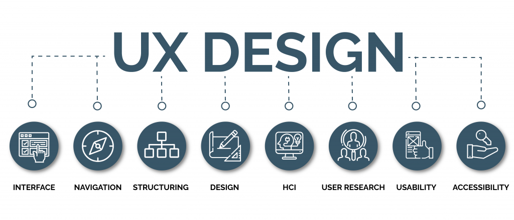
Usability pertains to the degree of ease users can accomplish a set of goals with a product. While frequently used interchangeably, usability is part of UX design. The former is the ease of use in completing a given task. The latter is the overall experience with the product.
 What are the qualities of a product with good usability?
When users first encounter a new interface, they should accomplish their intended tasks without relying on somebody else. As an individual experience, highly usable products are effective, efficient, engaging, error-tolerant, and easy to learn. Think of them as the “5 E’s of Usability”.
- Effective: Users can complete their tasks. Are users able to complete their tasks independently? What are the leading causes if users are unable to meet their functions?
- Efficient: Users can complete their tasks through the easiest or most minor labor-intensive route. How fast are they able to complete their tasks? How many clicks and pages do they go through? Do they take steps or visit pages they’re not supposed to?
- Engaging: Users find completing their tasks a pleasant experience. But, how do the users react while completing their tasks? Do they seem confused or annoyed on specific steps? Do they seem satisfied after the process?
- Error-tolerant: Users can recover from genuinely erroneous actions and situations. Do they encounter error prompts even if they make a correct step? When users genuinely make a mistake, are they able to recover and return to the right page?
- Easy to Learn: Users easily complete new tasks and even more quickly on repeat use. Does their first use of the product appear seamless? Where do they encounter bottlenecks or difficulty in the process? Upon repeating the steps or using the next iteration of the product, do users complete their tasks faster or more seamlessly?
How to test for usability?
Achieving these qualities of usability rarely comes on the first version of any product. Designers can’t wish away that their first try would be helpful enough to be shipped out. Product teams need to look out for flaws they might have overlooked and improve what could still be improved. This can only stem from Usability Testing, which is the process of testing the degree of ease in using a product.
Usability testing is different from focus groups, which is about listening to what participants say. In observing test users, it’s about what they do, not what they say. The types of usability testing depend on the complexity of the study, but they all entail the following features:
- Representative users: Invite participants who are representative of the product’s core users.
- Representative tasks: Ask the participants to perform the essential tasks of your product.
- Action-centric: Observe what the participants do. Give more credence to their actions than their feedback.
Designers must aim to monitor and measure usability throughout the product lifecycle – from the time it starts as a wireframe, then as a prototype, when it’s shipped out, and as it continues in use. Depending on the need, product teams have an arsenal of usability testing methods they can choose from, each with its merit, as follows:
- In-person: This is a formally structured, on-site, live-testing of users.
- Remote: Users are in their environments, at home, for example, to catch more natural, on-field insights.
- Guerilla: This testing is informally structured wherein product teams test their designs on passers-by and colleagues for quick insights. The data may be less accurate but can be quickly collected.
 Why is usability so important?
User research at the beginning of the design process is almost as necessary as testing. This sets up assumptions about user profile and behavior that the prototyping and testing cycles will rely on. Further, user testing will be of no use if the insights are not incorporated into the product. Iteration is the consequence of user testing. Each new iteration should aspire to have solved a bottleneck, a bug, or any design flaw that causes headaches, which users, whether digitally savvy or otherwise, know too well.
When users encounter usability issues, especially so-called showstoppers, these could amount to time lost, missed opportunities, frustration, and loss of trust in the service they’re transacting with. The consequences could even be more severe when money is concerned, particularly with eCommerce sites, payment services, and banking apps. Minor tweaks in usability could save users from these kinds of exasperation. For product owners – the companies and organizations that deploy digital services – such implications could spell the difference in user growth, market share, brand reputation, regulatory compliance, and financial results. There are, of course, numerous considerations that influence a product’s success, such as business model, market conditions, technical and cybersecurity factors, among many others. However, usability is entirely within the control of any given organization and its product teams.
Usability as a business priority
Usability can make or break a product. Usability testing and the requisite iterations are how organizations can meet customer expectations in today’s highly digitized economy. Our experts at Radiant Digital can help your organization conduct usability testing and deliver your digital products. For more information on our digital transformation services, contact us today.


