White space is a technique used when creating design layouts to ensure that your page’s important elements and content have room to breathe. Using white space is quite simple. Whether you want to emphasize an image, a graphic, or some text, all you need to do is leave blank space around the particular item you want users to focus on. Space is an important and often underrated design element that significantly influences the user experience.
Below we’ve highlighted a few types of white space and what makes white space so crucial for effective UX design.
Types of White Space
When designing for websites and applications, smartphones, or tablets, negative space is key to the usability and visual appeal of the user experience. Which elements are drawing the user’s eye? Are their items on the page that are partially obscured or easily ignorable? These are the kind of questions you need to ask when thinking about your use of white space.
There are two types of white spaces:
- Macro-space: this refers to the empty space between the main elements of the web page or app interface and the space around each element.
- Micro-space: this refers to the small gaps within each element, such as line spacing in the text, and the gaps between images, graphics, and logos.
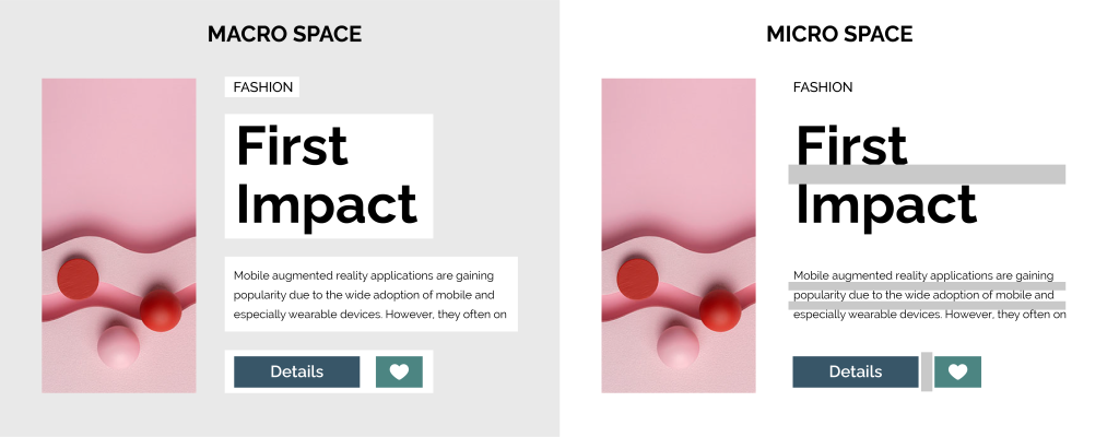
Both types of white space can help draw the eye, improve the readability of the content, and direct users to the critical elements on the page.
The Importance of White Space in UX Design
It can be tempting to cram as much information as possible onto the page or screen. Indeed. Many designers will be afraid of losing their user’s attention. As a result, they may overcompensate by making their pages cluttered, and they will neglect the value of whitespace. Users do not need to see everything all at once. White space can create a degree of separation between content and ensure that the page or interface is visually balanced. White space is all about the area between design elements.
Even though it is called white space, it does not have to be white. White space can be any color, pattern, background image, or texture as long as it is distinct from the foreground content. The three vital elements to consider when designing negative space are Legibility (Can the user read the content?), Focus (Does the white space guide the user through the content?), and Tone (Does the white space contribute to the tone of the overall design?).
Let’s look at some of the advantages of white space, which will help illustrate the important role in UX design.
Key Advantages:
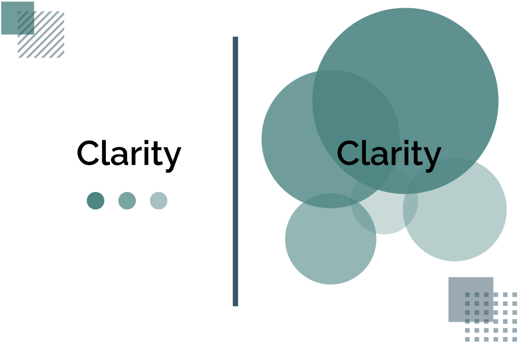
- Improves legibility
When white space is used effectively, it ensures that all elements on the page are easy to read and understand. Micro-spacing is particularly important to legibility. Macro-spacing can also separate paragraphs, headings, and key graphics.
- Connects multiple visual elements
White space allows you to create a balance of content throughout the page and connect various visual elements. With white space, you lead the reader’s eye from one place to another and make the whole reading process feel natural and linear.
- Ensures the page is clean and uncluttered
White space helps the page feel clean and prevents the user from getting distracted. It is key to balance information, style, and freedom to ensure the page feels purposeful and aesthetically pleasing.
- Add style to the page
White space can help create a tone and establish your brand’s style. Designers have been using negative space to create atmosphere and emphasize visual elements for years, and this same ethos can also apply in the digital realm.
- Directs user attention to the main elements
Where do you want to direct the user’s attention? White space can help UX designers create a coherent user experience that guides readers from one main visual element to the next. In general, the more space you have around an item, the more attention it can attract. With this technique, designers can encourage users to focus on clickable items, important features, and logos.
Making the Most of Your White Space
White space is key to enhancing your online content. By paying attention to exactly how much white space is used and where it is used, you will be able to design a user experience that is engaging and visually appealing. Every UX design decision, including those related to white space, should be informed by a purpose and a willingness to make something that engages and grows your user base.
To learn more about using space in digital design, feel free to contact our UX experts at Radiant digital.