In today’s digital world, the number of connected devices that generate data has increased exponentially. Recent research by IDC revealed that the global data volume would reach 163 trillion gigabytes by 2025. With more businesses relying on this data for decision-making, the design of business dashboards has gained prominence in the past decade. UX designers often need to coherently and visually communicate quantitative data to their teams and users. Thus, it’s paramount for them to follow the best practices in making data representations engaging. With the power of data visualization, UX designers can create effective analogies that can simplify complex datasets for human minds.
At Radiant Digital, we help clients make the most of their business data by leveraging data visualization in UX. In this blog, we focus on how data visualization is a crucial enabler for decision-makers to simplify concepts, identify new patterns, and obtain actionable insights for better decision-making.
What is data visualization?
Data visualization is a representation technique that involves restructuring datasets to obtain actionable insights. It uses graphs, charts, images, and other formats to convey complex ideas and logic better. UX designers must familiarize themselves with visualization to best represent data in their designs.
What does data visualization offer?
Benefits of data visualization
Critical considerations for data visualization
Methods to visualize your data via UX design
Bar graphs
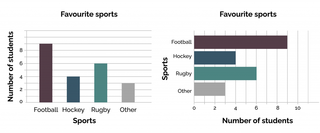 If you’re dealing with datasets that can change over the years or are based on specific categorizations, bar charts would be ideal for representation. Here are a few helpful tips.
Line graphs
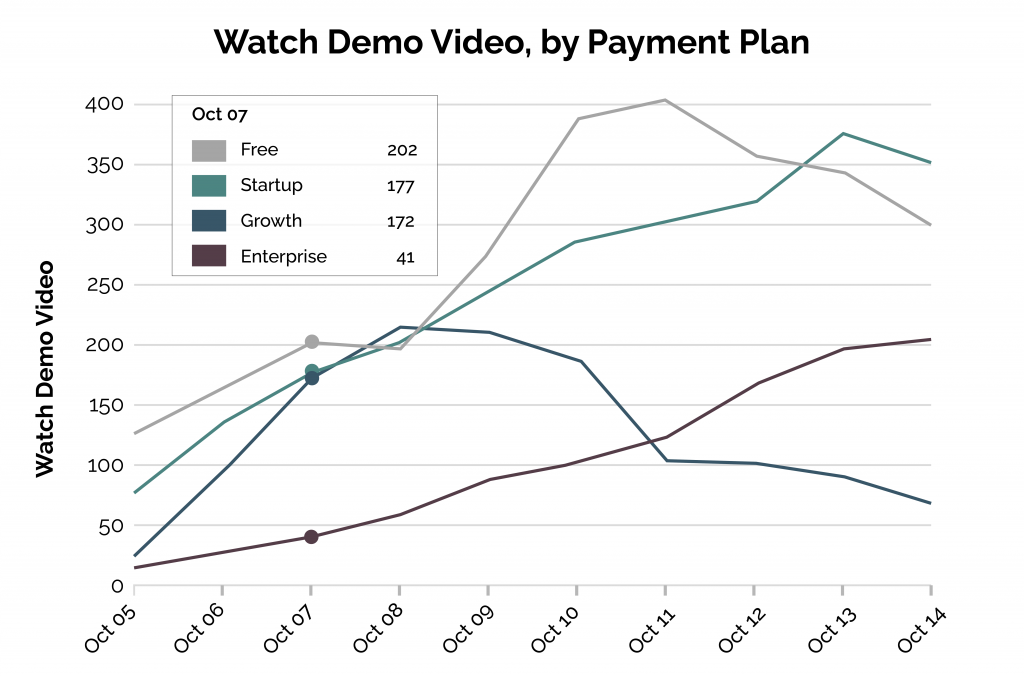 Line graphs help visualize specific datasets for a particular period. Combining them with bar charts helps visualize critical business datasets effectively. However, line charts represent deviations more efficiently and organically.
Pie and donut charts
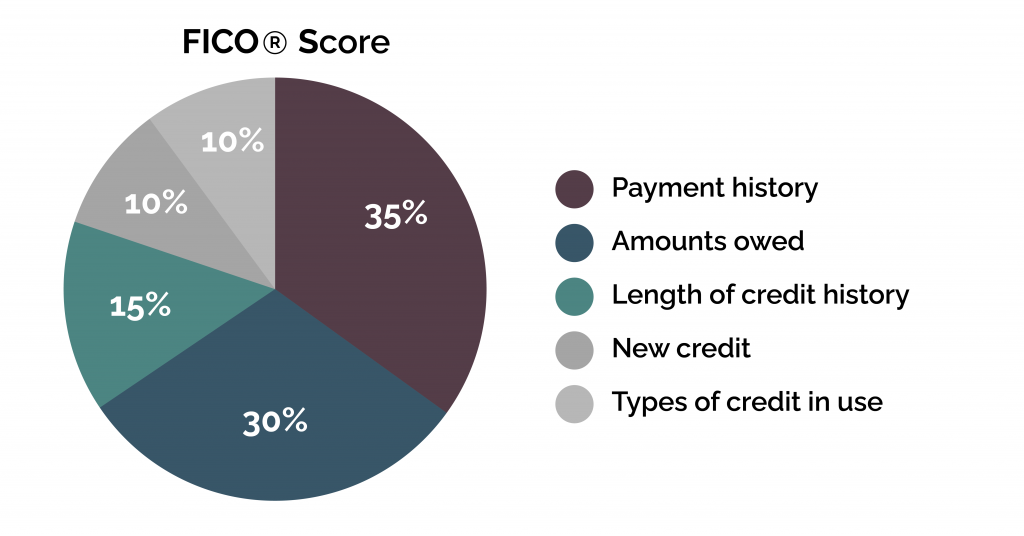 Pie charts and donut charts are critical data visualization attributes. However, these charts are often misused, considering most people fail to understand their purpose and the type of data best suited for them.
Heatmaps
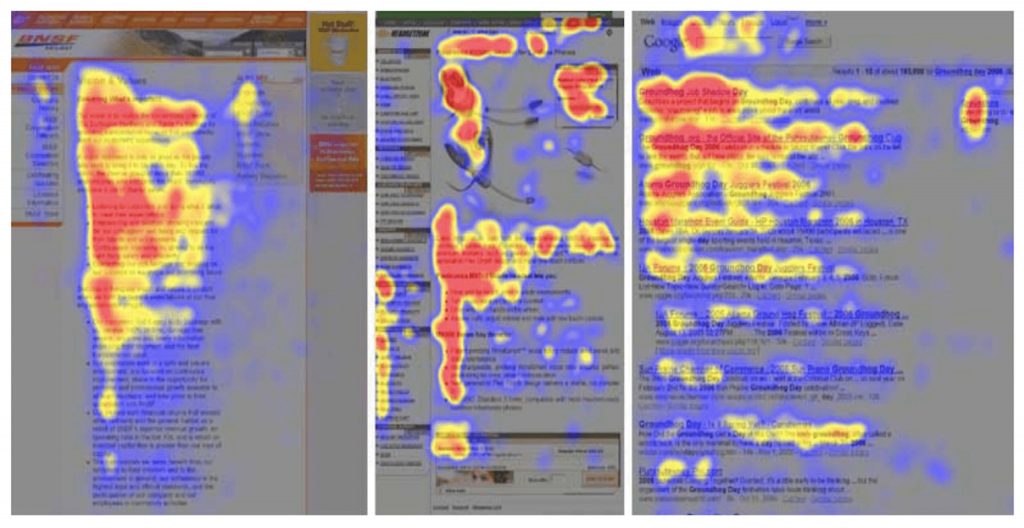 Heatmaps contain large areas, often parted into different sections, cells, colors, etc., to represent a content group. For example, in heatmaps, dark shades represent popularity or high frequency, while lighter shades indicate lesser traffic.
Retrospective
Edward R. Tufte once said, “the essential test of design is how well it assists the understanding of the content, not how stylish it is.” Data visualization through UX design can simplify information to a wide range of users.
At Radiant Digital, we apply the best practices in data visualization to make data genuinely valuable for enterprises and their customers. Connect with us to transform how you represent information.