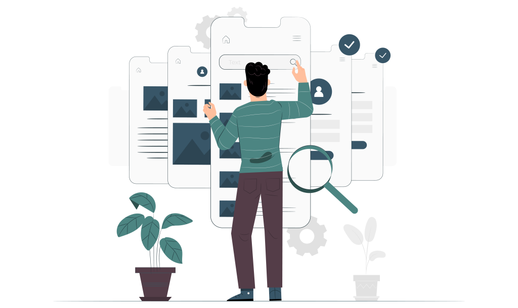
UX principles help guide designers in thinking, creating, and collaborating. Unfortunately, in many cases, designers take advantage of UX Laws and UX Effects in their designs without even knowing their actual impact. User experience design is about more than just visual design. Understanding user psychology is key to making designs that work effectively and look great.
In this post, we wanted to highlight the importance of UX principles by looking at a few of the most common principles and exploring how they help designers fulfill their ambitions.
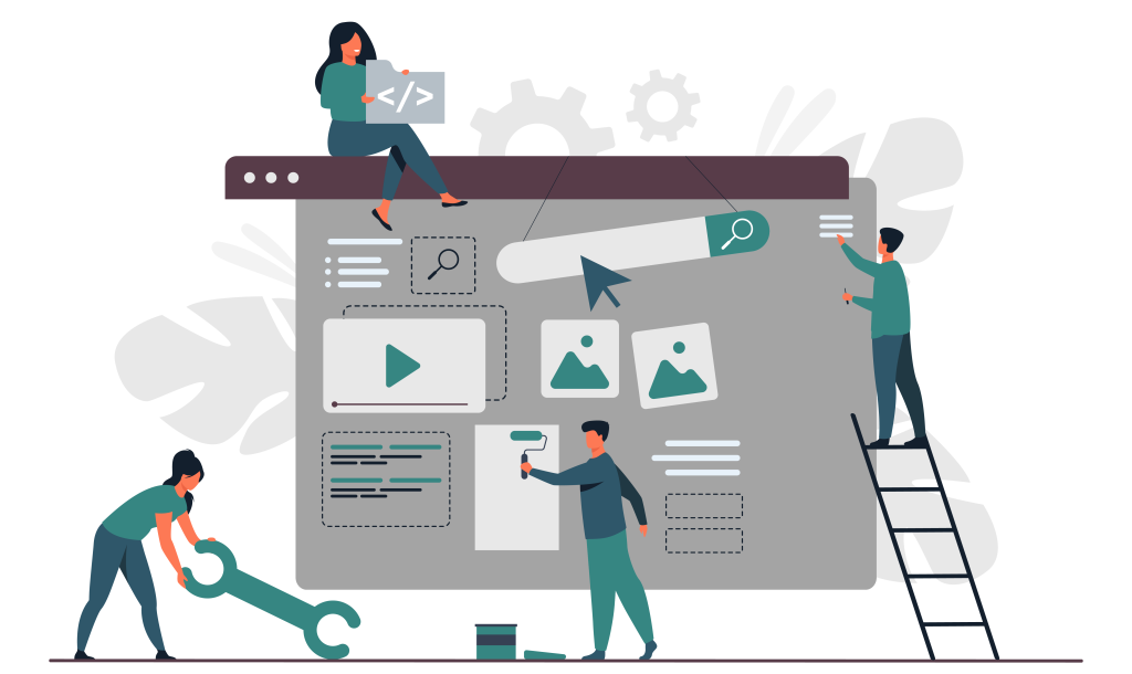
 UX Principles
Hick’s Law
This principle supposes that the time it takes to decide increases with the number and complexity of user choices. Therefore, when creating user experience designs, you want to limit the time it takes to make decisions and ensure users can quickly fulfill their needs with your product, services, software, or website.
 Goal Gradient Effect
This effect is about the idea that as people get closer to a reward, they speed up their behavior to attain their goal as fast as possible. This is because they are motivated by the end goal. So, for example, users will take time to fill out a form if they are shown that the result of filling out the cast is positive (e.g., Amazon’s Product Ordering or the ‘Time to Reach’ mechanic for Ola, Uber, and Swiggy & Zomato).
 Zeigarnik Effect
According to the Zeigarnik Effect, people remember uncompleted or interrupted tasks better than completed tasks. The Russian psychologist Bluma Zeigarnik discovered this effect by observing that waiters at a restaurant could recall the orders they had not yet delivered far better than those they had distributed. This effect has the same solution as the ‘Goal Gradient Effect’ and has been used by companies like Naukri and LinkedIn to affect ‘Profile Completion significantly.’
 Von Restorff Effect
This principle contends that when multiple similar objects are present, the one that differs from the rest is most likely to be remembered. This is an easily verifiable principle that is consistently worked into UX designs. For example, messaging apps like WhatsApp, Facebook Messenger, and Telegram use the Von Restorff Effect to show unread messages. And along the Macbook Menu Bar, bright red notification circles ensure that certain apps receive more attention than others.
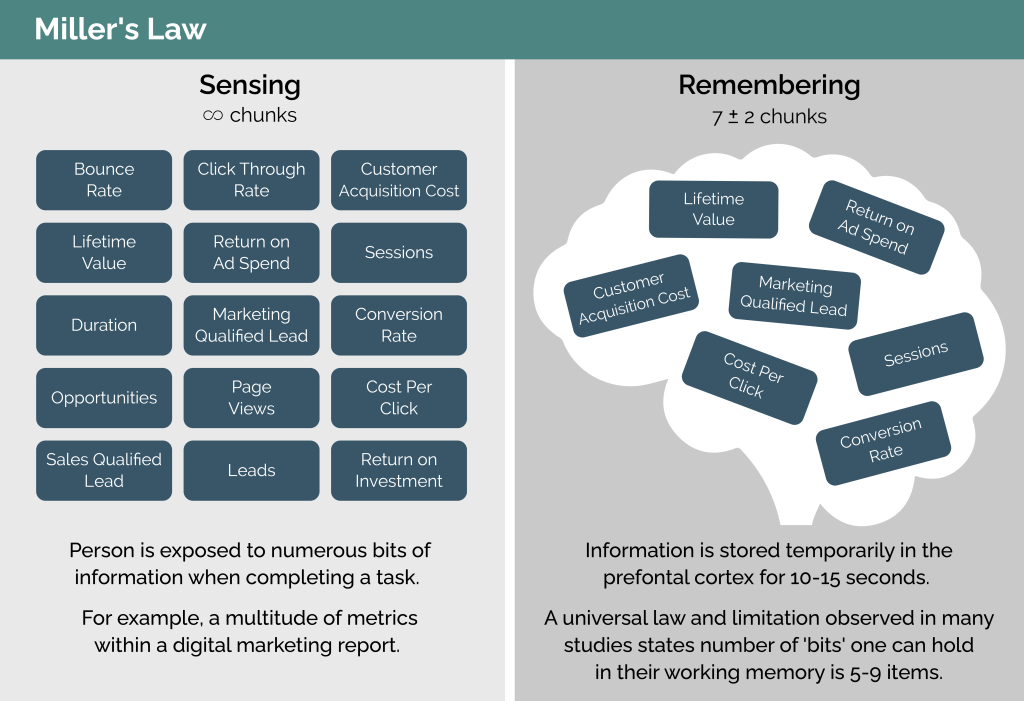
 Miller’s Law
Miller’s Law says that the average person can only keep 7 (plus or minus 2) items in the working memory. This is an important principle to abide by when creating UX designs meant to be used by many users. You don’t want to overload your user with information. This is why many modern menus have 4 or 5 prominent navigation buttons, and in Amazon’s reviews section, they will show around 5-7 reviews at first and hide the rest.
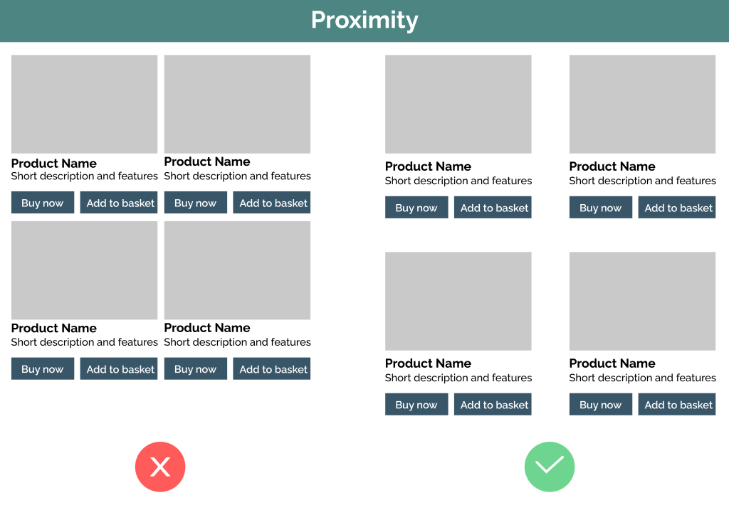
 Law of Proximity (Gestalt Principles)
The Law of Proximity is quite a simple one. It supposes that objects near or proximate to each other tend to be grouped. Therefore, UX designers should ensure that they don’t place items that have no practical relation next to each other on the screen layout. For example, the actionable buttons like footers will be separated from others on most websites to show the difference.
 Jakob’s Law
There is comfort in the familiar. Jakob’s Law is about the idea that users prefer your site, product, service, or design to work the same way as the other sites, products, services, or techniques they already know. For example, with websites, you want to have a simple ‘Login’ or ‘Sign Up’ page that is not too dissimilar to those of your competitors and other popular user options. In general, Login pages and search bars are not the right places for innovation because users are already so used to a standard format.
 The Heuristic Principles
Now that we’ve highlighted some of the essential UX principles let’s concentrate on the Heuristic Principles. There are 10 in total, but we’re going to focus on 5 in particular and how these broad usability tips can help you make products user-friendly, convenient, and enduring during the design stage.
1. Consistency and standards
Like Jakob’s Law, this heuristic principle is about sticking close to platform and industry conventions. As a result, users should not have to take long to understand your design. But, equally, they should not have to wonder whether the words or actions used within your design mean something different than the industry standard.
2. Visibility of system status
The design should keep users informed about what is happening at all times. There should be an appropriate feedback mechanism, and it should be clear whether or not they are using your system correctly. There should be indications or messages concerning the system status, like how a loading circle appears in Google Chrome when you click on any link from the search.
3. Flexibility and efficiency of use
Make sure that it is easy to use your design and that there are ways to speed up the process for those familiar with your design. The design should cater to both experienced and inexperienced users. There should also be a degree of flexibility.
4. Help and documentation
The user should understand and use your design at face value. However, there should also be help and documentation for users keen to learn and receive an additional explanation.
5. Aesthetic and Minimalist design
Everything that the users see and interact with should be relevant and essential. The interfaces should be as simple and as clean as possible. This principle can be applied to any design and help create accessible websites, products, apps, and services.
To learn more about the importance of UX principles, contact our UX experts here at Radiant Digital.