Most product and UI/UX designers will tell you that they’ve caught themselves getting carried away with introducing design elements they assume will enhance a product’s user experience. But, on the other hand, the effect was that these only caused distraction or confusion no matter how aesthetically appealing. In these moments, designers can remind themselves of a guiding principle to simplify the complicated — the Occam’s Razor. The Occam’s Razor is a mental model that states that the simplest explanation is preferable to those that are more complex. Among designers, this has meant that when confronted with competing designs that have the same function, select the simplest one. In evaluating your designs, remove as many elements as possible without compromising the intended functions.
 Origin of the Occam’s Razor Principle
Occam’s Razor, also known as the principle of parsimony, is attributed to William of Ockham (c. 1287–1347), an English Franciscan friar, scholastic philosopher, logician, and theologian during the medieval period. While this principle didn’t originate from Ockham, it’s heavily associated with him due to his frequent and effective use of the philosophical Razor in axioms in his written body of work such as, “Plurality must never be posited without necessity”.
The philosophical Razor refers to shaving away unnecessary assumptions or cutting apart two similar conclusions. Occam’s Razor is essentially a problem-solving principle that, when presented with competing hypothetical answers to a problem, one should select the one that makes the fewest assumptions. This is further reinforced in his writings on the principle of economy wherein he says, “It is futile to do with more things that which can be done with fewer.” Occam’s Razor has since been applied in many scientific fields, including biology, medicine, probability theory, and statistics.
How To Use Occam’s Razor in Design
Businesses and organizations often feel the urge to put every bit of information online to cover every need that every user may require. However, design and product teams can filter out the noise and focus on what matters most for a significant share of their users with sufficient user research. At the same time, with the capabilities that web and design tools now offer, designers and managers can get carried away into showing off how forward-thinking or design-savvy their companies are. At the heart of applying Occam’s Razor is being ruthless about removing the unnecessary for being effective. Here are the key points in how to use Occam’s Razor in UI, UX, and product design.
Design Only What’s Necessary
In applying Occam’s Razor, designers must evaluate each design element based on necessity. Following this principle requires a minimal user interface (UI) that still allows users to meet their objectives. By introducing animations, additional menu options, or certain navigation tricks, designers must pause and assess whether these are necessary to the user experience or unnecessarily complicate the user journey. For instance, designers can deploy heuristic evaluation, a detailed assessment of a product’s UI to surface usability issues, and identify ways to resolve them based on severity.
While the application of Occam Razor in the design process is more associated with the refinement phase — the shaving away of unnecessary clutter — the best approach is avoiding it in the first place. Instead, begin designing for the simplest version of a digital product and introduce additional elements only if it enhances the user experience.
Refine by Trimming the Excess
Designers or their managers need to be ruthless in trimming down their work. Design elements that don’t provide value should be removed altogether. Every aspect of the work should be evaluated based on purpose, importance, or necessity. If a more straightforward solution exists, then that version should prevail. Design critique sessions are an effective way to generate feedback from your colleagues. These will force you to articulate your design choices and surface design elements that might not be as effective you initially thought. As the French author, Antoine de Saint-Exupéry, said, “Perfection is achieved not when there is nothing more to add, but when there is nothing left to take away.”
Guide Questions
Here are some questions that designers can ask themselves as they create and refine their work.
Popular Examples of Simple UX
Let’s take a look at some widely known examples of how Occam’s Razor principles of simplicity, necessity, or economy have been applied in digital products.
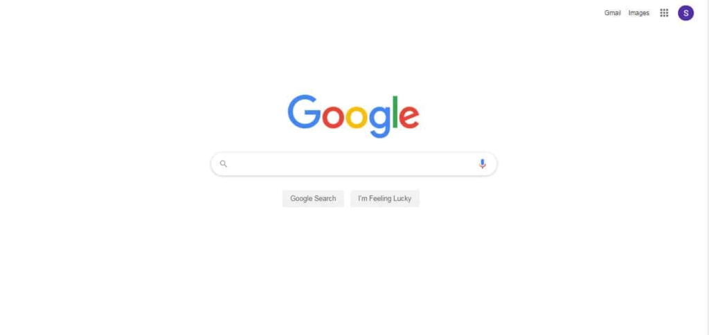
Google Search
The most widely used search engine, Google, directs user attention to its primary function: search.
PayPal
Paypal redesigned its website in 2014, which was overly complex before that. Since then, Paypal has continuously simplified its website and mobile app experience.
 Zara
Zara
Compared to most online stores of fashion retailers, Zara plays it simple with one photo on a white background and texts and icons in black.

Shaving off the clutter
Designers can sometimes be drawn into a fantastic idea without stepping back and asking if it’s essential to what users want to achieve. Occam’s Razor is a compelling reminder for designers when they create and refine their work. When inspired by several excellent ideas, choose the simplest one. Think of the simplicity that Steve Jobs embraced for Apple products at the onset. The earliest designs of the Macintosh and iPod still have a presence in today’s iPhone, iPad, and Mac. For instance, the single button on the front of their mobile devices remains integral to the simplicity of their design and the Apple brand as a whole.
Will you be working on a project that requires simplifying user interfaces and experiences? Reach out to our experts at Radiant Digital to learn more about our product design and development processes.