
The term ‘Minimalist’ brings clean white spaces with no single-use appliances or functionless decorations. This doesn’t mean, however, that to achieve minimalism in design, we must strip a website or software of all but the barest of functions. Instead, UX minimalism focuses on simplifying complex processes into a more accessible and better processes, making better apps, webpages, and systems. When incorporating minimalism in design, the goal is to eliminate unnecessary functions while conveying the intended message concisely.
What is Minimalism in UX Design?
With Big Tech companies like Apple and Google trailblazing minimalist websites, minimalism has become an influential contributor to the overall user experience. Synonymous with exclusivity, minimalism also has the advantage of faster loading times and good compatibility on both small and large screens. As with all UX design, minimalism focuses on maximizing user-friendly traits. But what sets the minimalistic approach apart from other techniques? As highlighted by Darya Tronsco, minimalism keeps the basic components of a system as simple as possible, allowing the user to interact without the direction or experience needed to deal with cluttered interfaces.
Why use Minimalism?
Aside from projecting a polished and exclusive company image, minimalist websites selling a product have an advantage over competitors. There is no better approach than minimalism for highlighting products, as there is nothing on the page to distract the consumer’s attention. Minimalism doesn’t only work by emphasizing a product; it also refines it. As UX designers, there is a temptation to include additional, superfluous elements to improve user design, which has the opposite effect. Minimalist UX Design involves relentlessly culling inessential components, which can be challenging to do with our work. To help with this, we’ve included a list of five essential features of Minimalist UX design, compiled by Amlan Sarkar:
- Quick-loading Interface because fewer components make websites more responsive.
- Increased SEO makes the layout easier for search engines to comb and index.
- Less maintenance because the interface is less complex, and bugs are easier to fix.
- Simplicity, which is classy and enhances accessibility.
- Meaningful content ensures all features have a purpose and facilitates easy navigation.
If these characteristics are applied to a project well, the resulting system is sophisticated, accessible, and a pleasure to use.
Achieving Minimalist Designs with Examples
The overarching question every designer should be asking themselves when creating a minimalist website is simple:

But even knowing this question, how do we achieve this? Achieving a minimalist design takes a lot of work, and we can’t replicate that clean website design just by removing components. To help, we’ve detailed a few research-driven techniques below:
Hick’s Law
This law was discovered in 1952 by American psychologists William Hick and Ray Hyman and stated that the time it takes to make a decision increases with the number and complexity of the available choices. When applying this law to minimalist design, it makes sense that giving users fewer choices in the form of more periodic functions will improve the overall user experience. Customers who find a website too difficult to navigate will look elsewhere. A great example of this is Google’s search page:
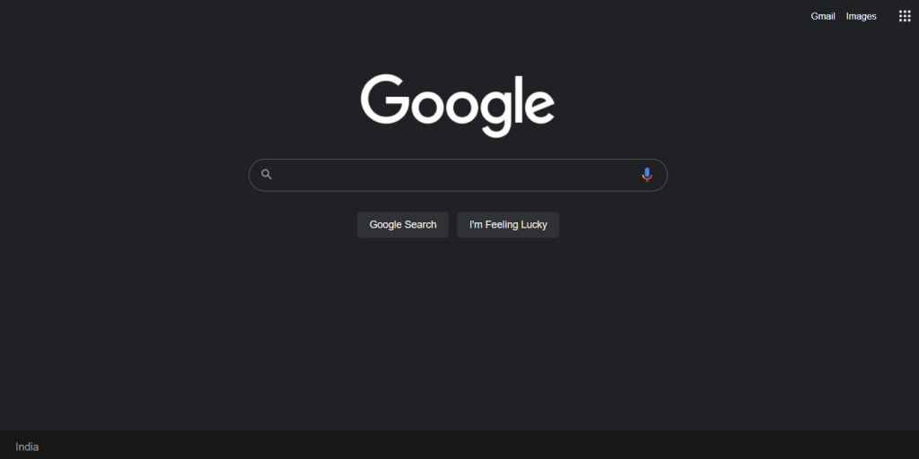 The center of Google’s search page is a search bar and two buttons. The choice is easy, creates positive user experiences, and helps make Google the leading search engine worldwide.
Whitespace
The negative space between content is called whitespace. Whitespace is essential to achieving a minimalist design because it highlights the important part of the system or page. Take Apple’s Apple Store Online page, for example:
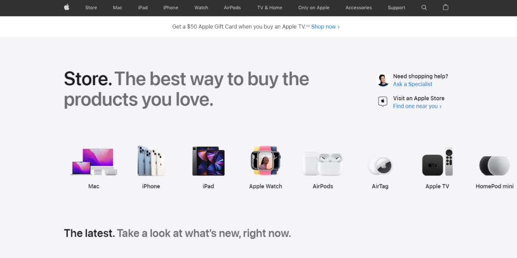 The generous amount of whitespace emphasizes the page's important part: the Apple products on sale. This focuses the user on the product while maintaining the clean, sleek design typical of Apple.
Color and Typography
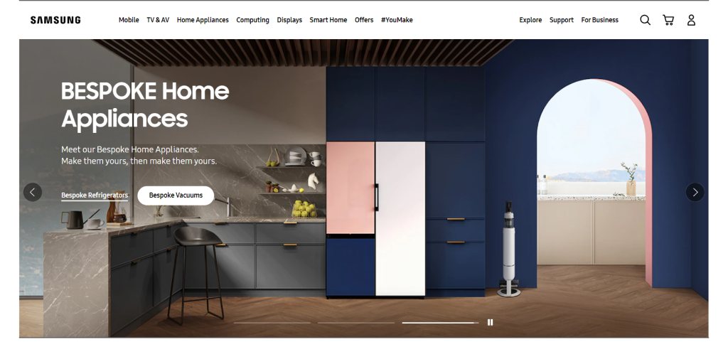
Minimalist typography involves choosing textual elements that create open, airy, and highly legible lettering. Generally, these simple letterforms have fewer curves and give the page a more modern appearance. Colour is also critical to minimalist designs, with most designers leaning towards grey, black, and white to provide a clean appearance. Samsung’s UK website uses dramatic, white typography that doesn’t distract from the overall image. The color of the lettering matches the elements of the picture, and the size draws the eye without taking over.
 Flat Design
This technique keeps everything from fonts to images as essential as possible, giving the system an aesthetically pleasing, functional look. The Winter Games Olympic Story website is an excellent example of flat design.

Everything from the black and white background to the single pop of color in the date makes this website easy to understand and navigate. The eye is drawn to two options: the hamburger menu or the Winter games button.
Visual Elements
Visual elements refer to site images, icons, or graphic illustrations. They are accessible to everyone and convey more information in a short time. However, in minimalist designs, there is a risk of pictures taking over the page and making any other minimalist choices redundant. One way of getting around this is using grayscale images or images with simple color palettes. A website that successfully uses color with a minimalist design in mind is Ikea:

Ikea’s UK homepage uses yellow in all images, which links back to their logo while giving the media a cohesive look. This maintains a minimalist, Scandinavian feel without sacrificing the joy in their products.
Minimalism in UX - Keep it Simple
The proof is in the webpage, Minimalism works. With the front runners in technology all using minimalist website designs, it is only a matter of time before maximalist web pages are a thing of the past. Making a minimalist product as a UX designer is not easy, but our UX experts are always here to advise if needed.
Get in touch to learn more about creating great, minimalist sites - we’d love to hear from you.
Relevant Articles

Enablers

Discover improved customer experience, productivity, and ROI.


Scalable, secure, and agile cloud infrastructure is taking the industry by storm.

Envisage a steady stream of insights through transparent, accessible data.