What are micro-interactions?
Even if you didn’t realize it, you’ve likely encountered several micro-interactions to get to this article. Micro-interactions are tiny, satisfying reactions people get from interacting with a web page or product, showing the user that their actions impact the digital landscape. Loading screens, click animations, and pinging email notifications are all cleverly conceptualized micro-interactions designed to keep a user entertained and optimistic about a product.
However, when poorly designed, micro-interactions can achieve the opposite and seriously damage the overall user experience. Think about how you’d feel if clicking ‘Add to Cart’ had no result. The likelihood is that you’d click again. And again. Before you know it, three unwanted duplicates would be in the basket, and you’d feel frustrated. Would you want to shop there again? Probably not.
Where do you see them?
Many micro-interactions happen without us registering them, including distinctive notification sounds, loading animations, and the haptic feedback, or short vibration, users get when pressing keys on a touchscreen keypad. Micro-interactions are so ingrained into a technology that successful implementation should leave a positive impression on the user, especially if they don’t notice it.
Some common and not-so-common micro-interactions examples are:
- Sounds or animations when toggling volume up and down.
- Micro-animations when clicking, scrolling or
- Loading screens.
- Payment refusal or acceptance animations.
- Error code.
Finding a successful and user-friendly product that doesn’t take advantage of micro-interactions in one way or another is a rarity. Being so easy and practical tools, it simply makes sense to use them.
Why are micro-interactions important?
Daniel Saffer famously said, “It’s the details that make systems feel more human and humane.” When considering how individuals interact with and use their devices, the truth of this statement is unavoidable. One of the pitfalls of product development is that in the pursuit of creating a valuable and in-demand product, it’s easy to lose sight of the essential humanity in UX design. UX developers need to consider people’s behavior when creating digital products for repeated use.
Depending on the target audience, developers should distinguish what impression they want the product to have. The micro-interactions on a gaming app will differ significantly from those in video conferencing software. Fears of unprofessional-seeming software can dupe product designers into creating impersonal and cold products which lack a human element. Micro-interactions are an essential way of bridging the gap between technology and man.
According to Daniel Saffer, an Interaction Design Lead in Smart Design, the key components of a micro-interaction are universal and include:
- Trigger: which instigates an action. This includes user-initiated triggers, such as clicking, pushing a button, or swiping, and system-initiated triggers, like an exit-intention pop-up.
- Rules: decide what happens after the trigger is engaged.
- Feedback: this is how you know an action is taking place. For example, clicking a ‘Pay Now button is a trigger, and the device buzzing is the feedback.
- Loop and Modes are needed when there are multiple feedback options. Perhaps the page can’t be found, so the appropriate feedback would be to change it to a friendly error code.
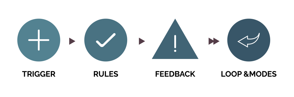
The figure above showcases the elements of micro-interactions coined the Process Cycle. If any part of this process fails, Saffer claims the micro-interaction will be unsuccessful, and most people will not react to the product as the developers intended.
Here are some great micro-interactions in practice:
Let there be light

At first glance, this Dark Mode button by Aaron Iker looks like any regular switch. Still, if you look closer, you’ll notice the crescent moon micro-interaction triggered by engaging and disengaging Dark Mode. This subtle detail tempts you into trying out Dark Mode and leaves you pleased you did. It’s a brilliant example of practical and attractive user design.
Sign me up!
Take this Notify Me button by Oleg Frovlov; it makes a usually unattractive task (signing up for an email list) seem light and rewarding. People are likely to feel like they’re signing up for useful

emails, not spam and the friendly ‘Thank You!’ notification afterward leaves them feeling positive.
Rewarding purchases
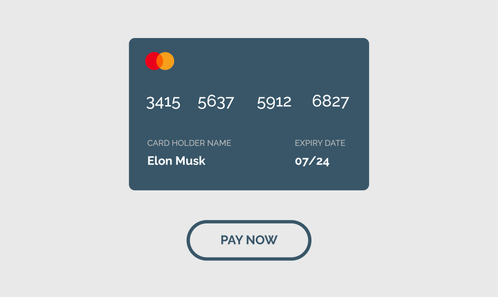
The more time a user spends staring at a motionless payment processing button, the more likely they will get bored, reconsider the purchase, and click away. This ‘Pay Now’ micro animation by Paarth Desai keeps users interested while the payment is secured, and the tick symbol feedback reinforces that they’re done the right thing.
Miro-interactions, a marriage of form and function
Ultimately, the truth is undeniable; Micro-interactions shape the user experience. Such a little thing can make a difference to users and drive home the importance of form and function in successful user experience design.
Still, want to know more? Get in touch with one of our UX experts to explain how micro-interactions can improve your product.