White space, grids, information architecture, principles, and purpose are all good UX design staples. An often-overlooked tool of UX design, however, is that of the subconscious. The human brain has a fascinating ability to observe an image and create a ‘whole’ more significant than the sum of its parts. It is wired to see structure, logic, and patterns that don’t exist but are perceived by the onlooker. That’s why we see children (and adults) often finding patterns and entities in things like abstract designs, trees, nature, etc.
Gestalt Principles – The Background
Gestalt Principles were initially devised in the 1920s when a group of German psychologists Max Wertheimer, Wolfgang Kohler, and Kurt Koffka developed theories around how people perceive the world around them. They aimed to understand how human perception can meaningfully interpret the chaotic stimuli surrounding them. This observation led to a set of descriptive principles, called Gestalt Principles, that connected the dots on human perception of objects and addressed the natural tendency to find order in disorder. These principles are at the heart of nearly every graphic design, adding inspiration and technique through well-placed elements, perceived as a “whole” in UX designs.
Why should Designers care about the Gestalt Principles?
Great designs are based on the best understanding of the influential role played by psychology in visual perception. Influencing how someone sees your design creations is a UX designer’s superpower. To achieve this, you’ll need to understand how their mind reacts to the message given by your design.
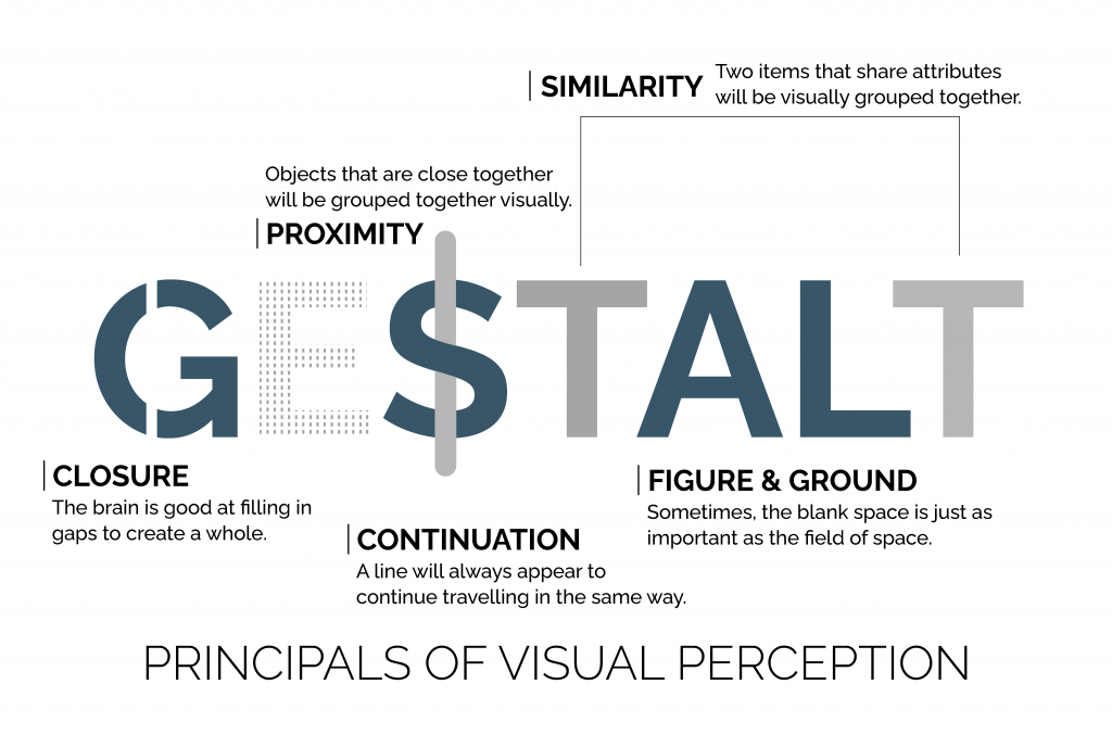
Gestalt Principles allow designers to strategize and plan out their designs from the multiple lenses of the observer. They also help associate meaning to design complexity in the following ways:
- Determine which design elements are the most effective in a given situation based on visual hierarchy, background shading, gradients, and contour. They also help in grouping similar items and distinguish discrete ones.
- By influencing visual perception, designers can direct their attention to specific focus and actions while creating behavioral change.
- Enabling the design team to solve a customer problem and meet user needs in a pleasing, relevant, and intuitive way.
Gestalt psychology and the Key Ideas Behind it
Gestalt psychology is a school of thought inspired by various principles associated with it. Taking advantage of the principles can help in thoughtful design creation that leverages the user’s subconscious mind’s power. “The whole is other than the sum of the parts.” — Kurt Koffka. This quote is Gestalt psychology in a nutshell. ‘Gestalt’ is German for “Unified Whole.” When humans see a group of objects, we perceive them as a whole rather than seeing them as individual objects or the sum of the parts. Even when the parts are unrelated entities, we still end up looking to group them as some whole. Some critical concepts behind Gestalt psychology include:
Emergence (The Whole is Identified First)
Emergence includes forming intricate patterns from simple rules. When trying to identify an object, we first seek to perceive its outline. This outline pattern is then matched against shapes and objects already known to the user to find a match. When the whole emerges through this outline pattern association, the user starts to identify the parts that form the whole. When designing, UX designers must factor in that people will first identify the general form of elements. A well-defined and easy-to-spot object contour will communicate more quickly than a complicated one that is hard to recognize.
Reification (The Mind Fills in the Gaps)
Reification is a perception aspect in which the object (based on perception) contains more spatial information than what exists. As we try to match what we see to the familiar patterns in our memory, we find a close match and then fill in the gaps of what we should be seen.
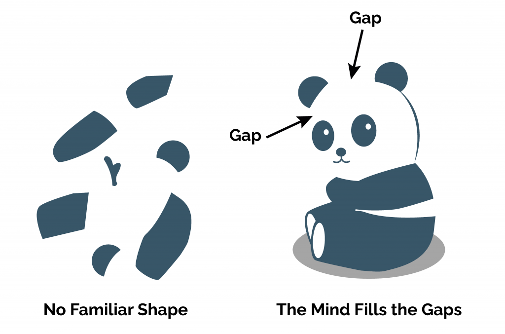
Reification suggests that designers don’t need to present the complete outline for viewers to see it. We can discount parts of the outline while including enough to make for a close enough pattern match. Taking advantage of this principle is vital for creating minimalist designs.
Multi-Stability (The Mind Seeks to Avoid Uncertainty)
Multi-stability inspires ambiguous perceptual experiences to move unstably back and forth between two or more interpretations.

For example, the image above is perceived either as two faces or a vase, but never both at once. Instead, you switch back and forth quickly between the one that is your dominant perception and the other, the less dominant one. From a design perspective, it’s essential to find a way to get users to see an alternative. Then, work to strengthen that view while weakening the insignificant view.
Invariance (Inclination Towards Recognizing Variants of the Same Object)
Invariance is a perception attribute in which simple objects are recognized independent of their orientation, scale, and translation. Humans may encounter objects from different perspectives. This has led to the ability to recognize them despite their varying appearances.
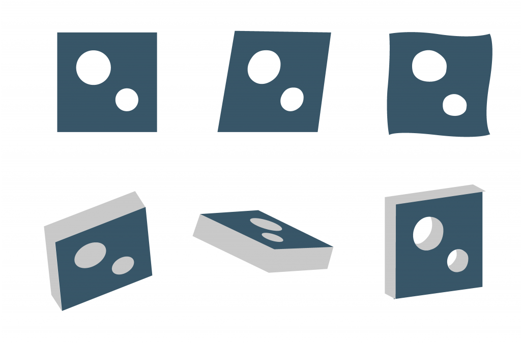 Recognizing someone you know when they stand directly facing you but not from a different facial profile is a prime example of this property.
The 7 Guiding Gestalt Principles in Design
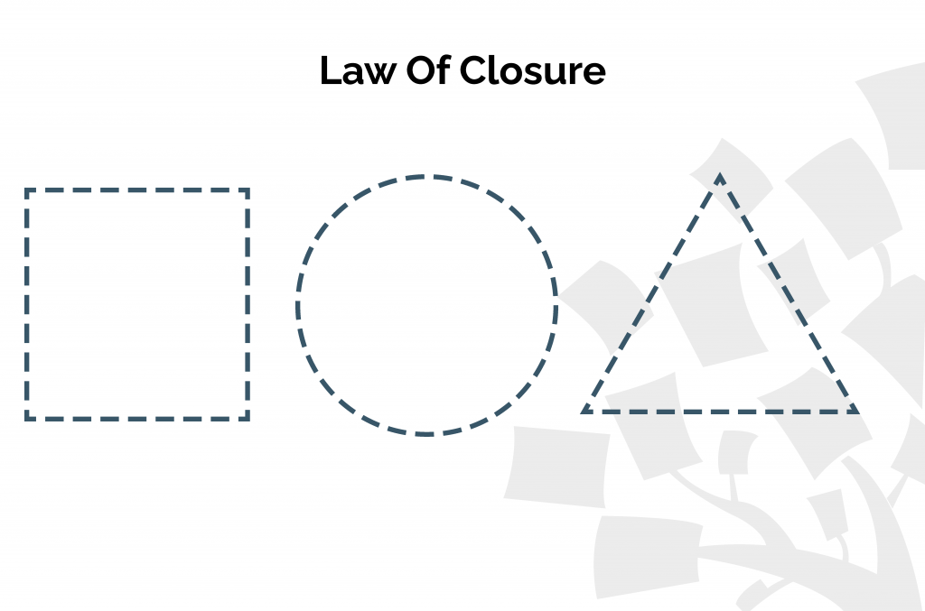 When humans see a complicated arrangement, the brain tends to look for patterns and fill in the missing pieces. This principle takes advantage of the negative space between components and allows users to perceive shapes and patterns based on their arrangement. You can use cleverly placed elements (lines, dots, shapes, etc.) in different and imaginative ways to let users appreciate them when they recognize pleasing “wholes” in them.
 This principle is excellent for graphic design and logo creation.
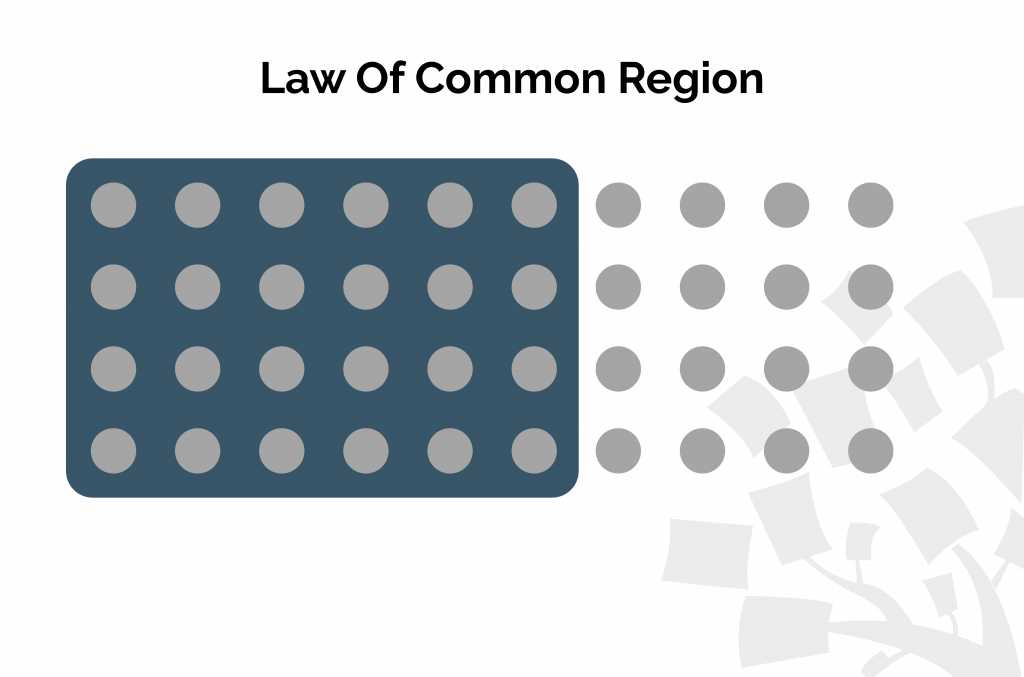 Facebook applies this principle for elements of likes, comments, shares, etc., that appear within the boundaries of a post while standing apart from others. Using this principle, designers can exhibit a connection/relation between elements by enclosing them somehow. Everything outside this enclosure is seen as unrelated. Combining this with the Law of Similarity, which we will discuss shortly, can help emphasize the relationship between component groups. Placing a border around a series of components creates a visual indicator and a subconscious connection with those components.
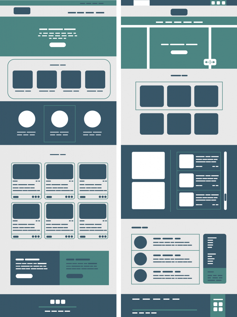 This principle is predominantly used for designing social media and web pages.
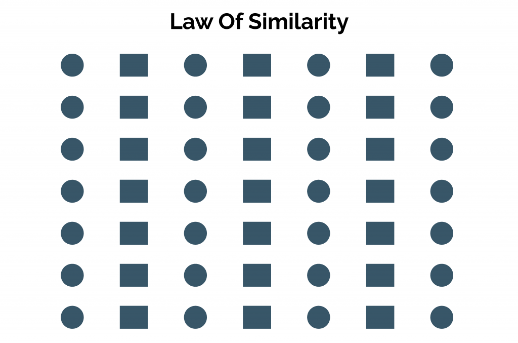 This principle states that when objects appear to be similar, users usually group them. Additionally, they also tend to think these elements function the same way. This grouping may be done based on size, shape, color, orientation, dimension, texture, and other object attributes that appear the same.
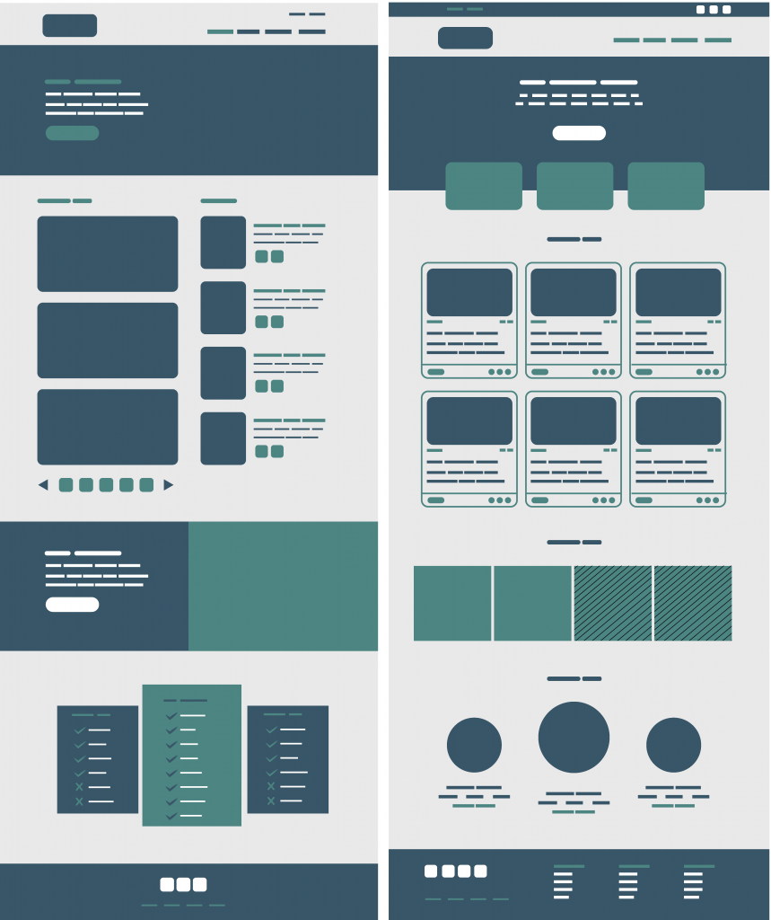 For example, by coloring your form fields on your login page or your buttons the same color, an association is formed between them, and a user will understand that the form fields are related. When similarity prevails, an object, different from the rest, can be emphasized and called ‘Anomaly.’ It is usually used to create visual weight or contrast that draws the user’s attention to specific focal point discoverability.
 Elements arranged closer to each other or grouped are perceived as related than those placed further apart. White space is vital as it creates a contrast to guide the user in the intended direction visually.
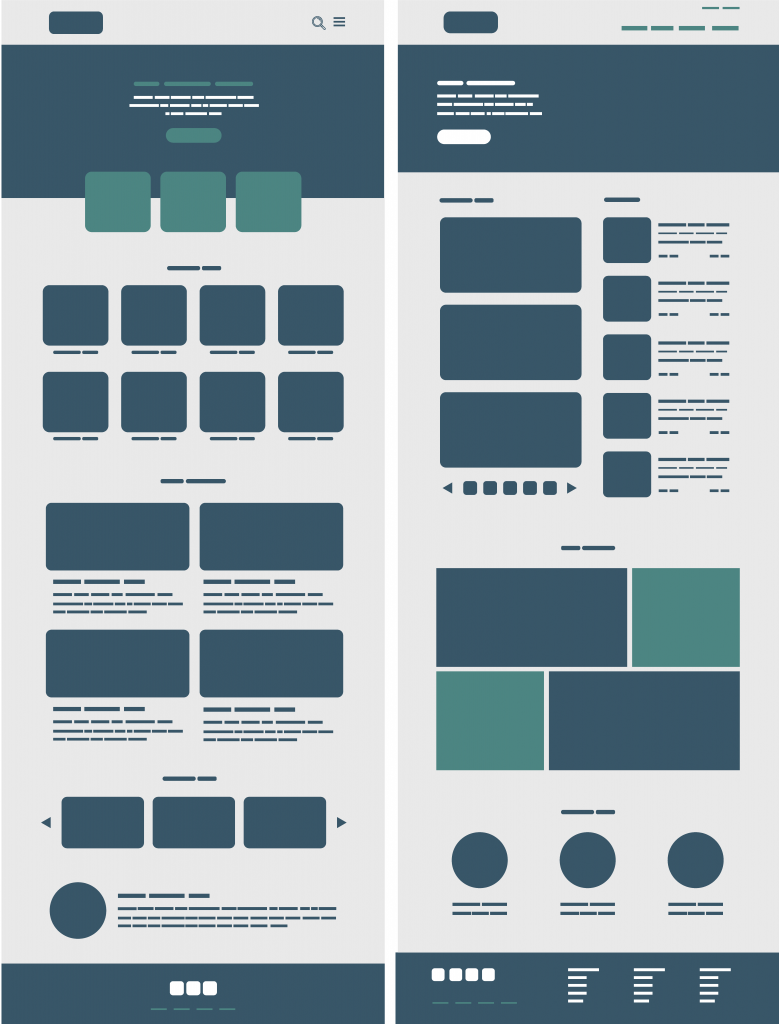 Element spacing boosts visual hierarchy and information flow, contributing to easy-to-scan layouts. With proximity, users can achieve their visualization goals faster and delve deeper into the content.
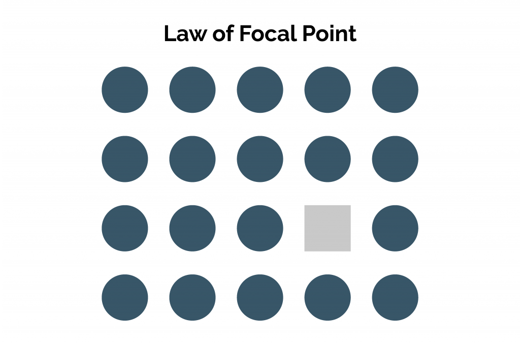 This principle states that the element/object that stands out visually will be the first point of interest that grabs the viewer’s attention. This may include on-screen elements breaking from a pattern, such as a square within a series of circles. Buttons, checkboxes, and radio buttons are excellent examples of Gestalt’s Focal point principle put into practice. Users immediately notice and focus on these elements because they have a different size, shape, or color than the other aspects.
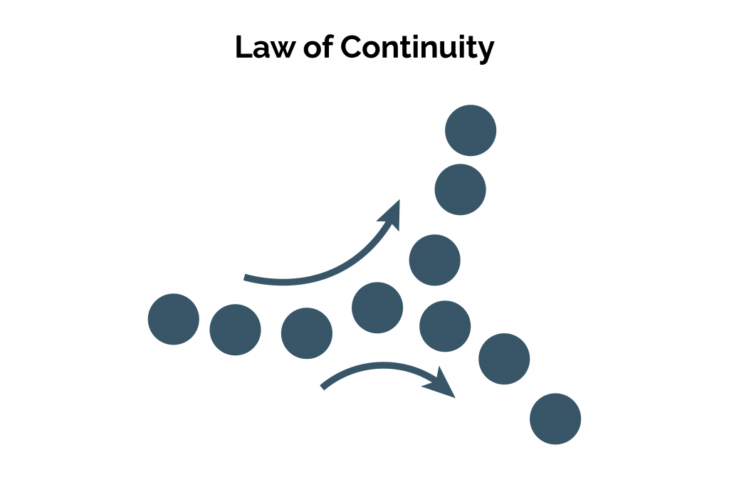 Elements arranged in a soft curve or line are perceived as more relatable than those set in a harsh line or randomly. The human eye naturally follows a pattern in orientation, making a more decisive relativity aspect than the similarity of color, size, etc. This principle strengthens the perception of grouped information, guiding users through different segments by creating an order. Disruption of continuity can signify the end of a section drawing attention to a new content segment.
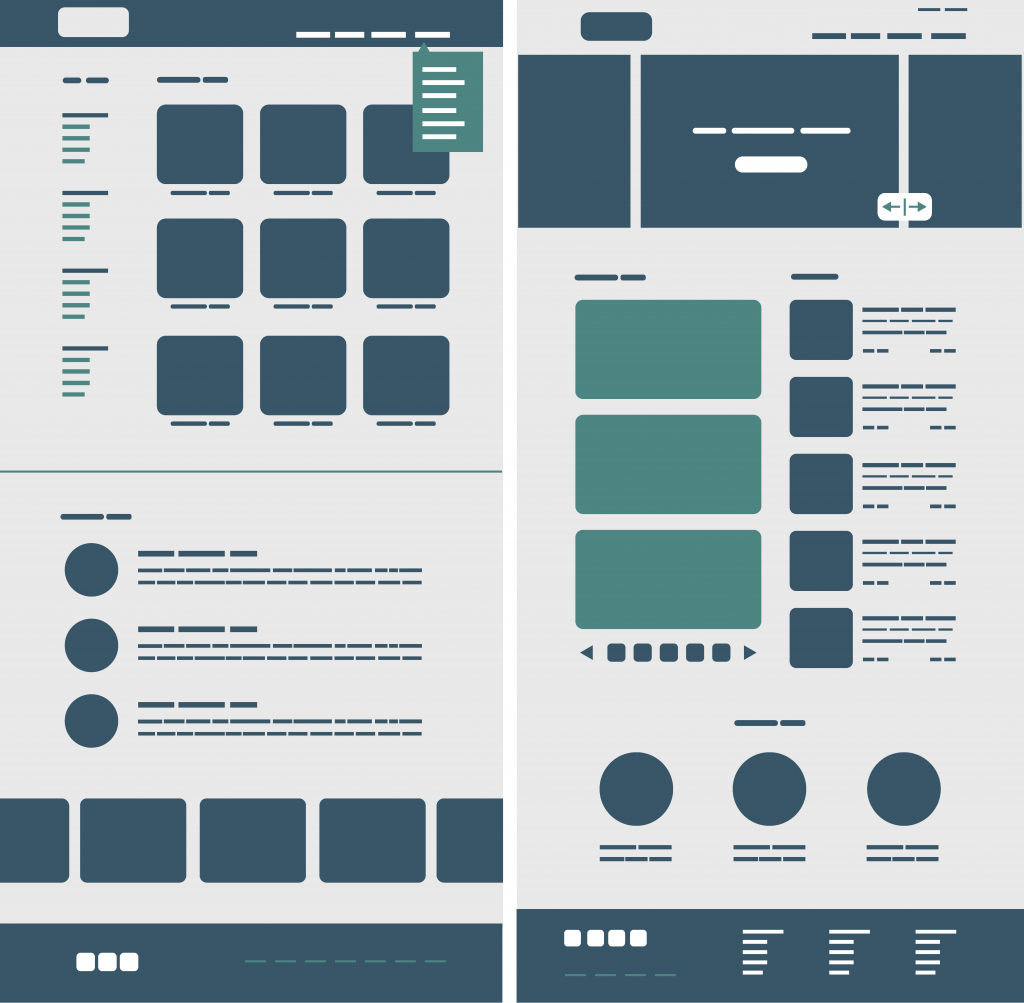 Tabs on the top of a web browser or the navigation options of a website are great examples. These options are generally vertical or horizontally aligned.
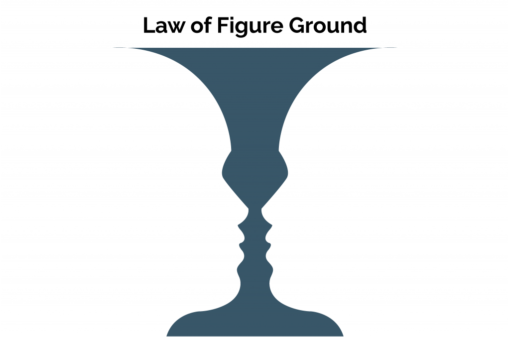 People instinctively perceive objects as either present in the foreground or the background. Design components are either prominent in the front (the figure) or recede to the background. The human brain will interpret the larger image area as the ground and the smaller as the figure. This principle can be useful when product designers want to highlight a focal point as an active or in-use element. The figure/ground relationship can stable or unstable depending on how simple it is to determine each element.
The aspects guiding this principle include:
- Area – The smaller of two overlapping objects is seen as the figure while the larger is seen as ground.
- Convexity – Convex patterns tend to be perceived as figures while the concave ones become the ground.
An on-screen component like a tooltip or a popover appearing on top or in the foreground exemplifies this principle.
Wrapping Up
Learning to implement any visual heuristic into your design can help elevate the user experience. Understanding the human brain’s workings and leveraging a person’s natural tendencies creates a more seamless interaction. UX design is about communication, convenience, and performance. Gestalt principles help achieve these goals while taking advantage of the subconscious of the mind. Gestalt principles are relatively easy to incorporate into any design.
Want to improve a design that seems haphazard or isn’t grabbing your users’ attention?
Connect with Radiant Digital’s UX design team to meet all your user interaction goals.


