
Often in UX design, transparency and feedback affect a users’ experience and how they engage with a system. Periodic feedback and system knowledge help users feel more in control, which supports better decision-making. The visibility of system status relates to communication and transparency, which are critical to user-system interactions.
Looking around for signs helps users manage tasks and time efficiently. For example, our phones and laptops display the remaining battery life to charge them when necessary. Similarly, email inboxes indicate how many unread emails lie in the mailbox and which ones are high priority.
Visibility of system status in UI is the first of Jakob Nielsen’s Ten Heuristics. Every UX designer follows these principles to ensure that their design is feasible, responsive, and user-friendly.
The system status should keep the user informed on what’s going on within the system with proper feedback at appropriate intervals. When users understand the current system status, they can determine the outcome of their prior interactions and the next steps.
Predictable interactions foster trust in the product and the brand, so UX designers prioritize the system status heuristic.
Definition
Visibility of system status defines how well the system state is conveyed to its users. This could include a dialog window, notification, an ‘appear and disappear’ text, and other mechanisms.
Why implement System Status in your design?
Knowledge is Power
Changing a system status with action requires knowledge about its current status. With this, you can overcome any gaps and decide what to do next to reach your goal. A lack of information always translates to a loss of control, resulting in diminishing trust in your design.
Staying in-the-know Means Better Control
Effectively displaying the system status encompasses proper communication with the user. After every system interaction, the user should be given a response from that system, informing them about the result and whether it is good, ineffective, or something that could impact other processes/tasks/outcomes.
Appropriate Feedback
Users need to understand if their interactions with the system were successful or not. Further actions can be taken based on the outcome of a previous one. The system should convey the outcome in a visible and comprehendible way.
Appropriate feedback is the most fundamental way of doing this. It keeps users informed of the current status and steers the interaction in the right direction. This saves effort and time when the user performs the correct actions instead of those, leading to confusion and error. Such feedback can include a change of color when the user clicks on a button or a progress indicator for a running background process. These feedback mechanisms show the user that the system is working, reduces uncertainty, and increases errors, such as clicking a button repeatedly due to a lack of system response.
Influence User Action
One key factor in displaying system status is predicting user behavior and guiding them to the next step. Doing this can influence the right actions while providing trust and security between your users and your product. On most e-commerce sites, communicating stock availability for a product influences their buying decision. When the stock is low, customers can immediately ensure they don’t lose a chance to purchase the product. Communicating if a user qualifies for free shipping or a specific deal can encourage additional purchases.
Communication Creates Trust
Understanding the system’s state helps users rely on the system to act as expected based on circumstances. The predictability of the interaction strengthens trust in the dynamics of the system and the brand.
Users should be informed about actions with consequences for mutual consensus required from a legal perspective. Any external event or time-based outcomes impacting the system state should be communicated clearly. For example, errors or interruptions during a system process need to be displayed effectively to the user for appropriate or remedial action.
Types of System Status Indicators in UX Design
While there are many creative system status indicators, here are some prominent ones used by UX designers today:
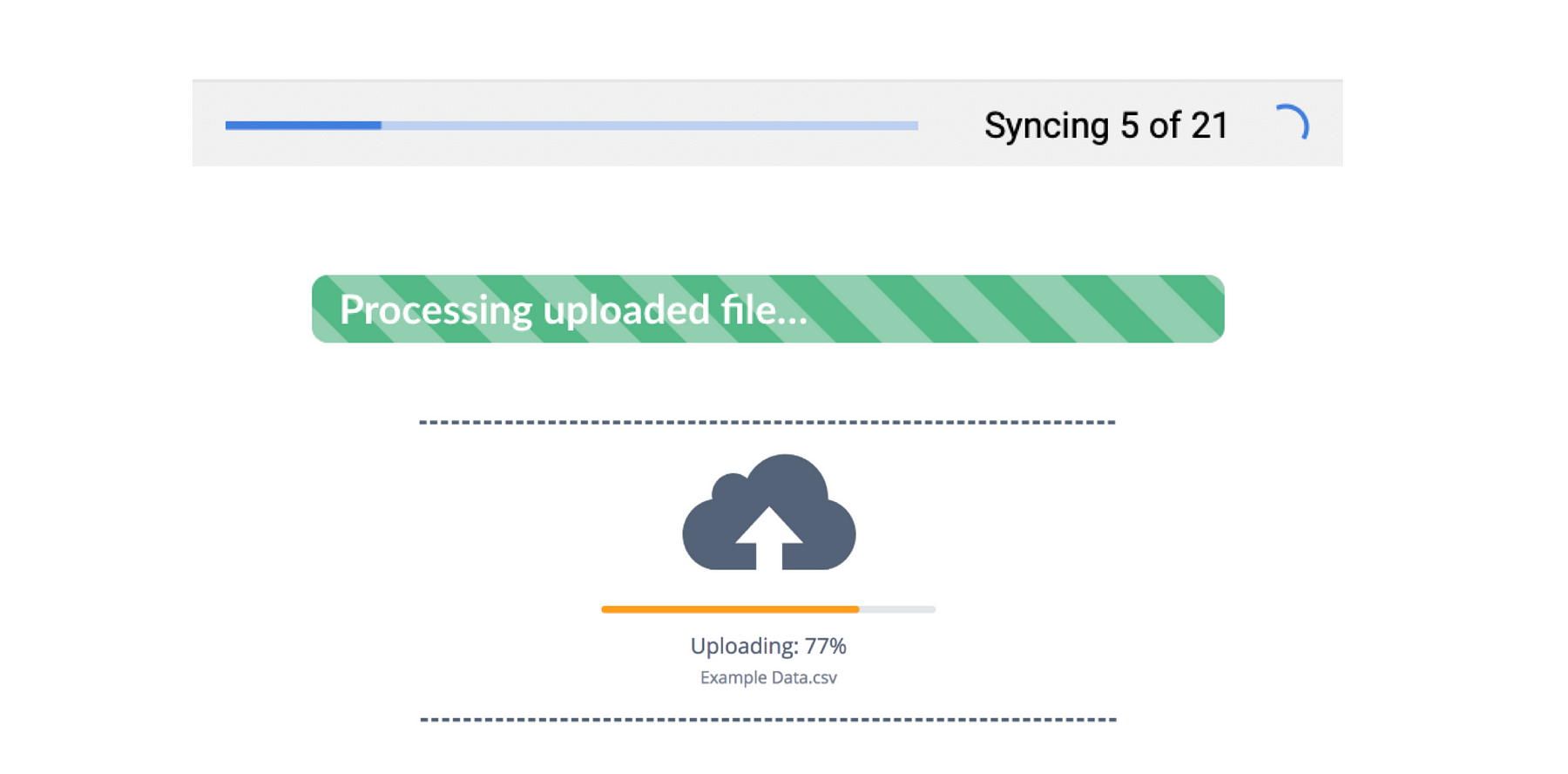
Progress Bar
This element is commonly used when a user uploads or downloads a file from an online or offline source.
A status window with a progress bar tells us how much progress has been completed or how much time is remaining by showing percentage (%), number file, or a bar. It also indicates process interruptions by an event or errors during the upload/download. The user can take corrective action at this juncture to restart or continue the process.
Here, the system provides enough feedback in a reasonable time after pressing the UPLOAD/DOWNLOAD button.

Image Source: Medium.com
An advantage of this design heuristic tool is running backend processes in the background while the users continue with other tasks. The user interruption level is low while the information level is high.
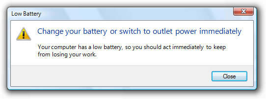
Pop-up
A pop-up is a window or bubble view with self-explanatory text with/without an image. It contains action buttons or other elements that appear over the existing user’s interface. Some pop-ups dim the interface behind to ensure that the user recognizes that the pop-up has appeared.
Keep in mind that pop-ups may prevent users from continuing until they resolve the issue indicated in the pop-up window. This is effective as a warning; it asserts the user performs some corrective or critical action. Conversely, pop-ups can be overly intrusive to a user’s workflow. It is recommended that pop-ups be used sparingly and only when necessary.
Pop-ups can be critical or non-critical. Critical pop-ups can impact system operation or status, while the non-critical ones are more informative.
Critical Pop-up

Image source: Microsoftdocs
Non-critical Pop-up

Image source: wishpond blog
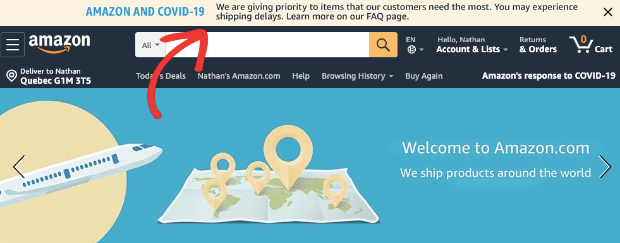
Notification Banner
A Notification banner usually contains some text that appears above a colored background. It generally appears from the top of the user’s viewport. These banners can sometimes be animated and slide into view.
They function similarly to pop-ups but do not dim or disrupt the user’s screen view. These banners also have a dismissal option where the user can make them go away or hide them.
Notification banners are effective and non-obtrusive to a user’s experience. However, these may not be as attention-grabbing as pop-ups.
Sometimes, a user may not notice that the banner appeared at all, so they are best used when you want to inform the user in their best-interest about a change or action that has already happened but is not very critical.
The message that appears in a notification banner can be dynamically set to change based on a time-based trigger. Many e-commerce and banking websites use this mechanism to update the user on policy, process, and status changes.
During COVID-19, notification banners have been the most-used system status tools on business websites and portals.

Image Source: OptinMonster
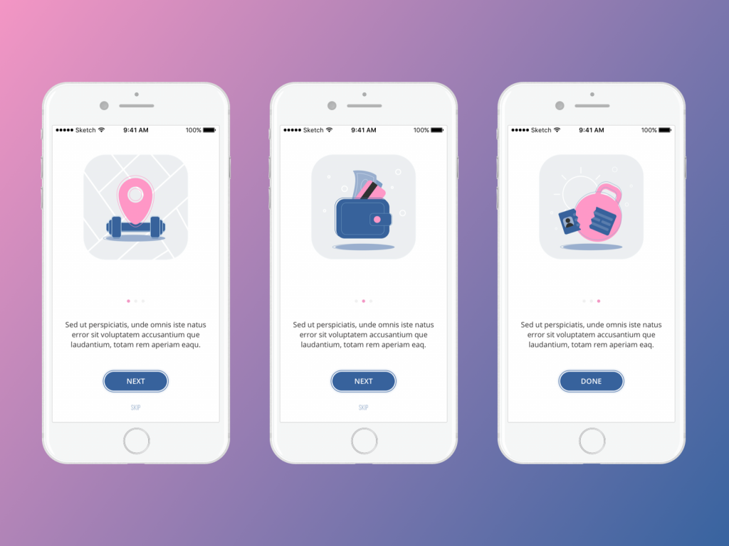
Informative Text
This type is used when an error occurs during form creation. Perhaps a user is creating an account on your website or configuring their settings. If a field is filled out incorrectly, colored text can appear near the form to inform a user about the validation error. This type of text keeps appearing until the user resolves the error and does not let the user move forward.

Image Source: wowmakers.com
Usually, informative text is associated with an action like submitting, continuing, next, or canceling, which is captured through a button. You’ll see this while installing an app for the first time.

Image Source: tubikstudio.com
Informative text can be used to denote errors and success as well. Tooltips are great examples.

Image source: appcues.com
Different color schemes like green for success and red for errors can be used for text display.

Image Source: isabelcastillo.com
All of the examples mentioned above are great ways to promote user interaction with a UX design. Banners can be used to inform users of limited-time offers. Colored text can alert users of unique interactions, and pop-ups can encourage users to sign up or subscribe to a service.
Final Thoughts
Visibility of system status is a tenet that promotes a high-quality user experience.
At its core, this heuristic enables open and continuous communication, which is fundamental to successful UX designs.
Uninformed users become poor decision-makers and will find difficulty in discovering their next steps towards task completion. Users also won’t figure out if their actions were effective and error-free without some system feedback.
The key is to let your users feel they are pivotal to interaction without blindfolding them or keeping them guessing.
At Radiant Digital, we help you implement this design heuristic and help your customers see the ‘bigger picture’ in your UX designs.


