We spend a lot of time staring at screens. Our reliance on digital interfaces has increased during the pandemic, and our screen time has also arisen. Half of the respondents to a survey taken earlier this year stated that, on average, they spent five to six hours on their phone daily, not including work-related smartphone use. Today, you now have a choice for how the interface on your phone looks. One of the simplest choices that can significantly impact your user experience is whether to go ‘Dark Mode’ or ‘Light Mode.’
In this post, we’ve explored the debate between Dark Mode vs. Light Mode.
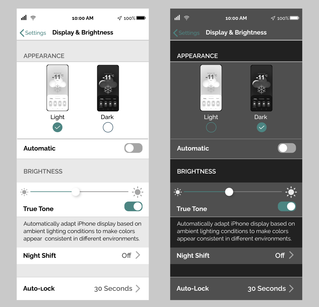
What is Dark Mode?
In the world user interface, ‘Contrast Polarity’ describes the contrast between the test and the background on a screen. In this context, ‘Positive Contrast Polarity’ refers to dark text on a light background (Light Mode). And ‘Negative Contrast Polarity’ refers to light text on a dark background (Dark Mode). Since digital screens first emerged on the market, devices have flicked back and forth between dark and light modes. For a long time, the light mode was the default on modern smartphones, but the dark way has made a strong resurgence in recent years. Dark mode displays produce less light than light mode displays which may affect both power consumption and how we perceive the information presented to us on the screen. To understand the impact of using dark mode compared to light mode, we must look at how the human eye works.
Sensitivity and visual performance
The pupil is a gateway through which light reaches the eye’s retina. The human pupil changes size depending on ambient and direct sunlight in the environment. When there is plenty of sunshine, the pupil contracts, and when it is dark, the pupil dilates to let in more light. These biological elements are something that UI and UX designers and developers have to consider when putting together interfaces. For example, when the pupil is smaller, the eye is less susceptible to aberrations and increases the depth of field. In this context, the eye doesn’t have to work as hard, and it is less likely to tire.
However, if the pupil is too small, which sometimes happens as we age, not enough light will enter the eye, and our ability to read the text and perceive images on a screen in low ambient light will be impaired. Equally, as we get older, we often become more susceptible to glare, a frustrating element that is more likely under bright sunlight. Beyond a stylistic desire, the creation of dark mode seems to be an attempt to accommodate a wide variety of sensitivities to light. Even though people with normal vision are well catered for with positive contrast polarity, dark mode is a valuable way to broaden the accessibility options for the user interface.
Dark Mode
Advantages
- May use less energy than light mode allowing your phone battery to last longer.
- It can potentially lessen eye strain in low-light conditions.
- Suitable for low-light conditions, especially when you don’t want your phone to be a beacon of light, e.g., in bed or a cinema.
- Preferably to light mode before you sleep because it emits less ‘blue light.’
Disadvantages
- The dark mode is not always suitable for eye strain, as text is sometimes washed out against a dark background.
- Less valuable if you are surrounded by bright ambient light
Light Mode
Advantages
- Many web pages, apps, and interfaces will have been optimized for the standard light mode.
- If you have standard/normal vision, light visual performance is usually better with light mode.
Disadvantages
- May drain your battery faster than dark mode, depending on your screen.
- Not discreet.
- More likely to keep you awake if used before sleep because of the amount of ‘blue light’ emitted.
Your choice: Dark Mode vs. Light Mode
Ultimately, visual performance tends to be better with light mode for most people. However, some people with cataracts and related disorders may prefer the visuals provided in a dark mode. The advantages of dark mode over light mode also depend on the type and duration of usage. For most people, the decision will come down to personal preference and habit. Additionally, the overall effectiveness of either mode can be modified, on the iPhone, by switching on Night Shift or by utilizing True Tone. With every new release and new phone, the accessibility options are growing. This is true for Apple, Samsung, and Google regarding hardware and software.
To learn more about digital interfaces and visual performance, feel free to reach out to our UX experts.