Application design is one of the most significant fields of endeavor in modern technology. Individuals, small teams, and large corporate entities are all working to produce apps that solve problems and create innovative solutions in various fields.
Ever since Apple launched the iPhone, people have been working together to maximize the potential of mobile apps and technology. As a result, every week, we can see more exciting ideas hit the app stores. So, how can we keep improving? How can we continue to make new and exciting UX choices in the applications we create? Let’s take a look at some valuable tips.
1. Stop using long tutorials and lengthy feature explainers.

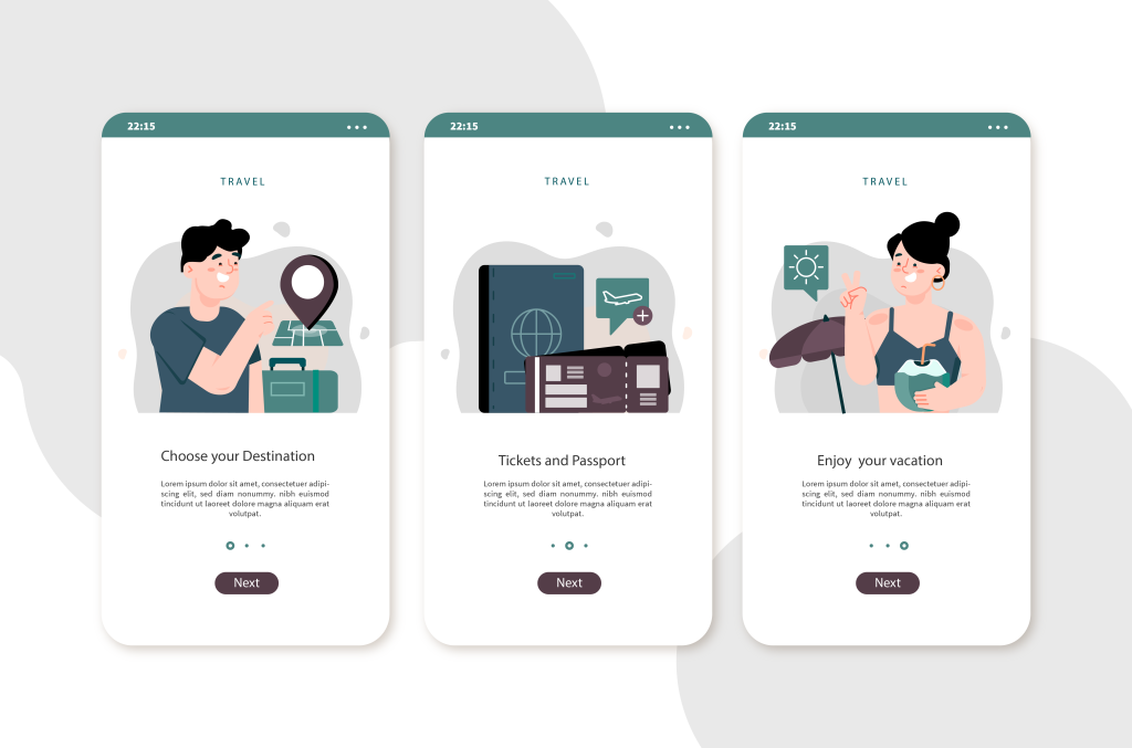
Your app needs to be easy-to-use and intuitive. We’ll give you a hint; it needs to be simple if an app is helpful on a smartphone screen. If you need to use a lengthy tour of features to familiarize your user with the app, you’ve likely tried to shove too much in the way of features into this release. Users are likely to be fatigued by pop-ups telling them what to do, and they’re likely to disengage if your key elements are not as intuitive. There are benefits to using industry-standard designs and concepts. One of the main benefits is that tech-savvy users will instantly know how your app works.
In general, users won’t mind growing with your app throughout multiple releases, but they will be unlikely to read incredibly long tutorials over and over again. It is important to instantly capture your user’s attention and make your new features as intuitive as mobile apps.
2. Review your user requests.

It can be tempting to publish new releases without talking to users when you have a tight timeline. But this is a common mistake that leads to a diminishing user base, poor reviews, and practical issues. Luckily this mistake is easy to fix: review your user requests. This is easy to do for most app development teams. Firstly, get your hands on your users’ data to your support teams. You can quickly identify which features your users want and what their frustrations are. And that should be it, right?
Hold on a second!
Mostly, those people who contact support are those who have had frustrations. What about 99% (or more) of your users who’ve never spoken to support? Indeed, you’d rather keep on making them happy rather than devote your time to keeping the 1% who use support happy? Well, if you want to improve the UX of your app, you’ll have to do both. You still have to talk to your users even if you think you know what they want. Inevitably, their experience and your knowledge will combine to create a better version of your app.
3. Make the most of the hardware and screen technology.

When people spend more than a month’s wages on a smartphone, they want you to use all the bells and whistles of their phone. One of the easiest ways to improve the UX of your app is to understand the hardware on which it is being used and optimize the app accordingly.
For example, there’s no excuse for skimping on retina display-ready content. Your UX can be enhanced by matching and exceeding people’s expectations. This means you have to be aware of the features available on the new iPhone or Samsung Galaxy, or Google Pixel. Then it would help if you tailored the UI and UX of your app to ensure that you maximize the potential of the hardware and make the most of the touchscreen technology.
4. Keep it as simple as possible.

Strip out everything you don’t need, and give your users a straightforward and streamlined journey. Even if you have a solid UX base, you can confuse and eventually lose users with the content you include. Make sure you are only including new features and content if they enhance the way your users can use your app. If in doubt, throw it out! And stick with the primary, most usable, and most intuitive features.
5. Keep notifications to a minimum.

You don’t want your app to be the cause of constant noise. Incessant notifications can quickly become annoying and cause users to delete your app altogether. Keep your notifications to a minimum. This is particularly true if your notifications aren’t that important. Users don’t need to know about every minor change or update. If they are curious, they will find out for themselves, and they will appreciate an app that isn’t constantly poking them.
At Radiant, we understand the value of intuitive, modern, and considerate design for UX. Hopefully, these five simple tips will help you refine the UX for your app so that you can create the next big app on the market.
How can you improve the UX of your application while staying true to its original purpose? To learn more about UX design and effective digital transformation, contact our experts.


