Notifications usually evoke mixed reactions from users. They can be beneficial at times, but they can be a nuisance at other times. All notifications serve the purpose of informing the user. They are powerful tools that notify users about app crashes, new messages, new features, and possible updates. They are a great way to re-engage users who have forgotten about your app from a marketing perspective. From a design perspective, notifications are a key distinguishing element that helps to create an engaging user experience (UX). Let’s take a brief look at how notifications work, the common types of notifications, and their role in creating a compelling UX.
What are notifications?
 Notifications are very easy to understand. Notification is simply the act of bringing something to the user’s attention. In the digital world, notification is the easiest way for an app or interface to notify the user about something or relay a message without opening the app. The primary example of a notification is an email alert. Most people receive emails every day. If you have your notifications turned on, a flash message will appear on your smartphone, tablet, or computer screen when you receive an email.
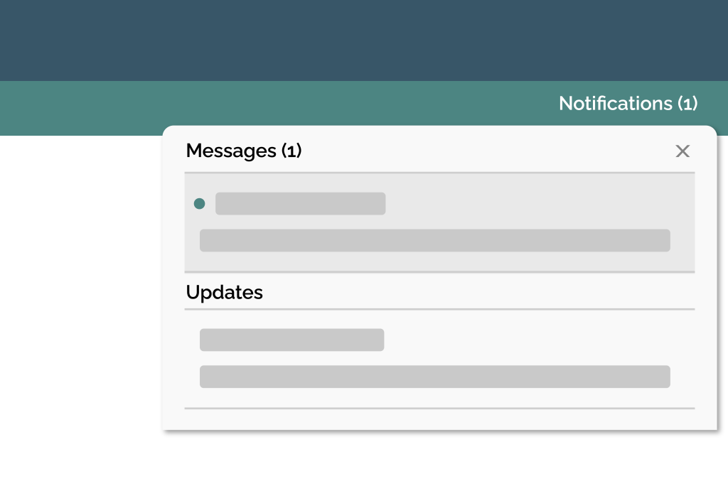
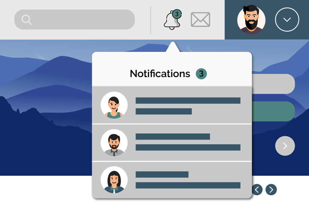
At this point, the user has several options. First, they can open the app directly by interacting with the notification. Equally, they can dismiss the notification by sliding it away or clicking a dismiss button. The notification gives the user a brief, to-the-point understanding of the matter without opening the application itself.
Types of notifications

Below we’ve highlighted a few of the most common types of notifications.
- User-generated notifications are targeted towards particular people, and another user informs their content. For example, WhatsApp messaging.
- Context-generated notifications are created by an application after receiving permission from the user—for example, a Google Alert.
- An app creates System-generated notifications based on specific needs, ranging from re-engagement notifications to spam.
- Push notifications are clickable pop-up notifications that aim to update new features, performance changes, and recommendations.
- Notifications that require action from the user.
- Passive notifications are merely informational alerts that require no user action.
There is a time and place for all of these notifications. In addition, most apps will enable or disable certain notifications to provide the right experience.
What makes a good notification?
There are a few key elements that make a notification effective. In general, a notification works best when it is:
- Non-interfering: A notification is more often than not an act of interruption. To master the UX of notifications, you have to create reports that are as unobtrusive and non-interfering as possible.
For example, a notification for an app shouldn’t pause or disrupt the user’s experience of another app. For instance, nobody wants to be watching a TV show on Netflix and have that experience interrupted with continuous pop-up notifications from their fitness app. It is all about timing and context. User research and artificial intelligence are great ways to understand when user’s want notifications and when they find them annoying. Then you can use this data to inform your design and optimize your notifications to make them as unobtrusive as possible. - Contextual: out-of-context notifications help no one. They will confuse and possibly annoy users, and the notification will probably not serve its purpose of drawing people to your app. Good notifications are deployed in the proper context and at the right time.
- Small in size: It is essential to make a notification big enough to read but small enough to allow users to continue using their screen visually. The best notifications are relatively small in size and never cover other essential information on the screen. Usually, notifications appear at the top of devices in a standard rectangular form that makes them easy to interact with or dismiss.
- Used to serve warnings: Some of the most effective examples of notifications are warnings to do with traffic, weather, and health. Notifications are a quick and easy way to communicate essential and possibly life-saving information.
For example, a flashing light on your car dashboard to tell you something’s wrong with the car or a severe storm warning that pops up on your phone and gives you time to look for shelter are both examples of effective and necessary notifications.
The success of these notifications, and many other notifications, depends on timing and how concisely they convey the correct information.
To learn more about the utility of notifications and how you can take your digital transformation to the next level, get in contact with our UX experts at Radiant Digital.


