How do you create UX designs that stand out? For example, how can you improve the user’s experience by simply changing the color or shape of an item?
The Von Restorff Effect theory is that people are more likely to remember the outlying thing when presented with a list of similar items that includes one unique, isolated item.
“If all but one item of a list are similar in some dimension, memory for the different item will be enhanced. The modern theory of the…effect emphasizes perceptual salience and accompanying differential attention to the isolated item as necessary for enhanced memory…Distinctiveness is a useful description of the effects of differences” – R. Reed Hunt.
The theory emerged from a study undertaken by the German pediatrician and psychiatrist Hedwig von Restorff, after whom the idea is named. It has since become a guiding principle for designers in many lines of work.
The Von Restorff Effect is also called the “Isolation Effect.” The effect is easily illustrated and can be found throughout our everyday lives.
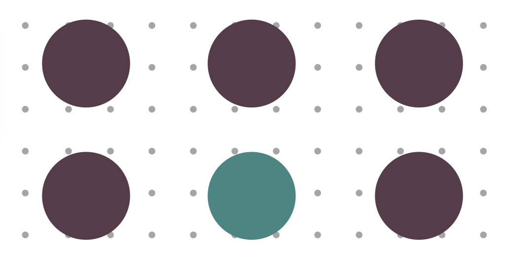
Look at the six circles: Which one is most memorable?
 Is it the five black circles or the one red circle that sticks in your mind? This is how simple the Von Restorff Theory is. In this example, the red circle is more memorable because it is distinct from the five black circles. There are five homogenous stimuli and one different stimulus. This theory can be used to enhance UI and UX design. Simple changes that create distinct elements within a design effectively transform user experiences.
Memorable Design Aspects
Color is not the only aspect of design that can create something distinctive. You can alter designs in many ways to illustrate the Von Restorff Effect. Other design aspects include:
● Shape
● Size
● Spacing
● Highlighting
● Making bold or italic
● Underlining
All UX designers should be aware of how these design aspects can impact the way users experience their designs. For example, how can you use the Von Restorff Effect to improve the experience if you design an app or web page? Maybe it’s about making certain buttons or clickable options of different colors or sizes to emphasize their importance. Often the simpler, the better. Users will evaluate elements differently depending on whether they are isolated or placed next to an alternative. For example, as a designer, you can make one choice look more attractive by placing it next to an option that is bland and not distinct in any way.
Usage
Many of us are visual beings and visual learners. Using the Von Restorff Effect to highlight important information amongst a group of similar information is a critical visual tool to improve UX. It can relieve the stress of sifting through multiple visual communication pieces to find the most relevant detail. For online retailers and e-commerce businesses, the Von Restorff Effect can be used to highlight discounts or changes in price. Below we’ve highlighted some real-time examples to illustrate how the Von Restorff Effect functions.
 Kissflow Pricing Page
In this example above of Kissflow’s Pricing Page, the use of the ‘Border Color’ and ‘Most Popular’ tags distinguishes the ‘Advanced’ plan from the other three. This shows how you can draw the user’s eye with a distinctive design.
 Myntra Product Listing Page
Equally, in this example from Myntra’s Product Listing Page, our eyes are naturally drawn towards the “Trending” tag. This is because a small tag can considerably boost the sales of that product.
 Interaction Design Foundation-Home Page
In this example above from Interaction Design Foundation’s Home Page, by looking at the completed circle and it’s color (red), it is evident that the first course is closed for enrollment. Simple design choices like this show how subtle and impactful the Von Restorff Effect can be.
 MacBook Menu Bar
Similarly, take a look at this MacBook Menu Bar. Again, the user can clearly distinguish which app requires their immediate attention. Furthermore, the bright red notification circle ensures that the messaging app receives the most attention. While the Von Restorff Effect has broad applicability, designers should also avoid overusing it. Too many distinguishing elements can cause users to become distracted and make your design feel cluttered. On the other hand, nothing will grab the users’ attention if too much goes on. The essence of the Isolation Effect is about standing out.
Standing Out
Ultimately the Von Restorff Effect is about being distinctive and standing out from the crowd. This is harder than it seems in a design world where everyone is trying to create something new and unique. However, distinctiveness can be as subtle as it is about bright, eye-catching designs. If you are designing a product or service, a web page, or an app, the Von Restorff Effect can be a valuable guide to ensure that you are creating a distinctive and memorable design.
At Radiant, we understand the value of being distinctive in a digital world. As we help businesses navigate the journey to a digital enterprise, we aim to create innovative and unique solutions. In the world of UX, particularly those who appreciate the Von Restorff Effect, we will create engaging and memorable interactions.
To learn more about the Von Restorff Effect and UX Design, contact our UX experts.


